This notebook provides visual examples of how NDIndex slicing works using images. By wrapping an image in an xarray DataArray with 2D coordinates, we can see exactly what regions are selected by different slice operations.
import matplotlib.pyplot as plt
import numpy as np
import xarray as xr
from matplotlib import cbook

from linked_indices import NDIndex
Setup: Load an image and create 2D coordinates
We’ll use matplotlib’s sample image and create a 2D coordinate system where the coordinate values vary non-uniformly across the image.
# Load matplotlib sample image
with cbook.get_sample_data("grace_hopper.jpg") as image_file:
image = plt.imread(image_file)
# Convert to grayscale for simpler visualization
gray = np.mean(image, axis=2)
print(f"Image shape: {gray.shape}")
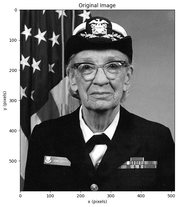
fig, ax = plt.subplots(figsize=(6, 8))
ax.imshow(gray, cmap="gray")
ax.set_xlabel("x (pixels)")
ax.set_ylabel("y (pixels)")
ax.set_title("Original Image")
plt.tight_layout()Image shape: (600, 512)
Create a 2D coordinate with a gradient
Let’s create a 2D coordinate that increases diagonally across the image.
This simulates a derived coordinate like abs_time = trial_offset + rel_time.
ny, nx = gray.shape

# Create 1D coordinates
y_coord = np.arange(ny)
x_coord = np.arange(nx)

# Create a 2D "derived" coordinate: diagonal gradient
# Each row has values offset by the row index
# This is like: derived[y, x] = y_offset[y] + x_coord[x]
y_offset = y_coord * 2  # Each row starts 2 units higher
derived_coord = y_offset[:, np.newaxis] + x_coord[np.newaxis, :]

print(f"Derived coord shape: {derived_coord.shape}")
print(f"Derived coord range: {derived_coord.min():.0f} to {derived_coord.max():.0f}")
Derived coord shape: (600, 512)
Derived coord range: 0 to 1709
# Visualize the derived coordinate
fig, axes = plt.subplots(1, 2, figsize=(12, 6))

ax = axes[0]
ax.imshow(gray, cmap="gray")
ax.set_title("Original Image")
ax.set_xlabel("x")
ax.set_ylabel("y")

ax = axes[1]
im = ax.imshow(derived_coord, cmap="viridis")
ax.set_title("2D Derived Coordinate\n(diagonal gradient)")
ax.set_xlabel("x")
ax.set_ylabel("y")
plt.colorbar(im, ax=ax, label="derived value")

plt.tight_layout()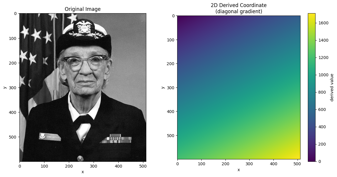
Create xarray DataArray with NDIndex
Now we wrap the image in an xarray DataArray and attach the 2D coordinate with NDIndex.
# Create DataArray
da = xr.DataArray(
    gray,
    dims=["y", "x"],
    coords={
        "y": y_coord,
        "x": x_coord,
        "derived": (["y", "x"], derived_coord),
    },
    name="image",
)

# Apply NDIndex to the 2D derived coordinate
da_indexed = da.set_xindex(["derived"], NDIndex)
da_indexedScalar Selection
Selecting a single value finds the cell closest to that value in the 2D coordinate.
# Select the cell where derived is closest to 500
result = da_indexed.sel(derived=500, method="nearest")
print(f"Selected point: y={result.y.item()}, x={result.x.item()}")
print(f"Derived value at that point: {result.derived.item():.1f}")
Selected point: y=0, x=500
Derived value at that point: 500.0
# Visualize scalar selections at different values
fig, axes = plt.subplots(1, 2, figsize=(12, 6))

# Show image with selected points
ax = axes[0]
ax.imshow(gray, cmap="gray")

targets = [200, 400, 600, 800, 1000]
colors = plt.cm.plasma(np.linspace(0, 1, len(targets)))

for target, color in zip(targets, colors):
    result = da_indexed.sel(derived=target, method="nearest")
    ax.plot(
        result.x.item(),
        result.y.item(),
        "o",
        color=color,
        markersize=10,
        label=f"derived={target}",
    )

ax.legend(loc="upper right")
ax.set_title("Scalar Selection: Points where derived=target")
ax.set_xlabel("x")
ax.set_ylabel("y")

# Show derived coordinate with iso-lines
ax = axes[1]
im = ax.imshow(derived_coord, cmap="viridis")
# Draw contours for each target value with matching colors
for target, color in zip(targets, colors):
    ax.contour(derived_coord, levels=[target], colors=[color], linewidths=2)
ax.set_title("Derived Coordinate with Iso-lines")
ax.set_xlabel("x")
ax.set_ylabel("y")
plt.colorbar(im, ax=ax)

plt.tight_layout()
Slice Selection: Bounding Box Behavior
When you select a range with slice(), NDIndex returns a bounding box - the smallest
rectangular region containing all cells with values in that range.
This is important: the bounding box may include cells outside your requested range!
# Select range: derived between 400 and 600
start, stop = 400, 600
result = da_indexed.sel(derived=slice(start, stop))

print(f"Requested: derived in [{start}, {stop}]")
print(f"Result shape: {result.shape}")
print(f"Result y range: {result.y.values[0]} to {result.y.values[-1]}")
print(f"Result x range: {result.x.values[0]} to {result.x.values[-1]}")
print(
    f"Derived values in result: {result.derived.values.min():.0f} to {result.derived.values.max():.0f}"
)
Requested: derived in [400, 600]
Result shape: (301, 512)
Result y range: 0 to 300
Result x range: 0 to 511
Derived values in result: 0 to 1111
def visualize_slice_selection(da_indexed, start, stop):
    """Visualize a slice selection showing the bounding box behavior."""
    result = da_indexed.sel(derived=slice(start, stop))

    # Get the bounding box coordinates
    y_min, y_max = result.y.values[0], result.y.values[-1]
    x_min, x_max = result.x.values[0], result.x.values[-1]

    fig, axes = plt.subplots(1, 3, figsize=(15, 5))

    # Original with bounding box
    ax = axes[0]
    ax.imshow(da_indexed.values, cmap="gray")
    # Draw bounding box
    rect = plt.Rectangle(
        (x_min - 0.5, y_min - 0.5),
        x_max - x_min + 1,
        y_max - y_min + 1,
        fill=False,
        edgecolor="red",
        linewidth=3,
    )
    ax.add_patch(rect)
    ax.set_title(f"Original with Bounding Box\nderived in [{start}, {stop}]")
    ax.set_xlabel("x")
    ax.set_ylabel("y")

    # Derived coordinate with mask
    ax = axes[1]
    derived = da_indexed.derived.values
    in_range = (derived >= start) & (derived <= stop)

    # Show derived with in-range cells highlighted
    ax.imshow(derived, cmap="viridis", alpha=0.5)
    ax.imshow(np.where(in_range, 1, np.nan), cmap="Reds", alpha=0.7, vmin=0, vmax=1)
    rect = plt.Rectangle(
        (x_min - 0.5, y_min - 0.5),
        x_max - x_min + 1,
        y_max - y_min + 1,
        fill=False,
        edgecolor="red",
        linewidth=3,
    )
    ax.add_patch(rect)
    ax.set_title("Cells in range (red) vs bounding box")
    ax.set_xlabel("x")
    ax.set_ylabel("y")

    # Result
    ax = axes[2]
    ax.imshow(result.values, cmap="gray")
    ax.set_title(f"Result: {result.shape}")
    ax.set_xlabel("x")
    ax.set_ylabel("y")

    plt.tight_layout()
    return fig
visualize_slice_selection(da_indexed, 400, 600);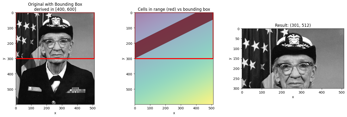
Different Slice Ranges
Let’s see how different ranges produce different bounding boxes.
# Narrow range - smaller bounding box
visualize_slice_selection(da_indexed, 500, 550);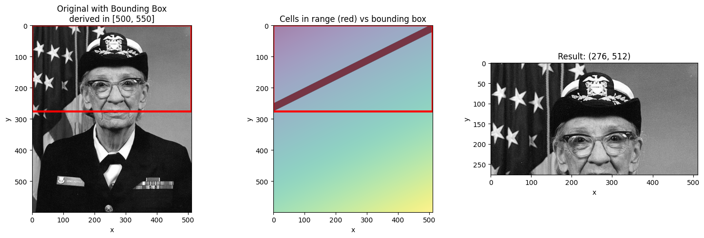
# Wide range - larger bounding box
visualize_slice_selection(da_indexed, 300, 900);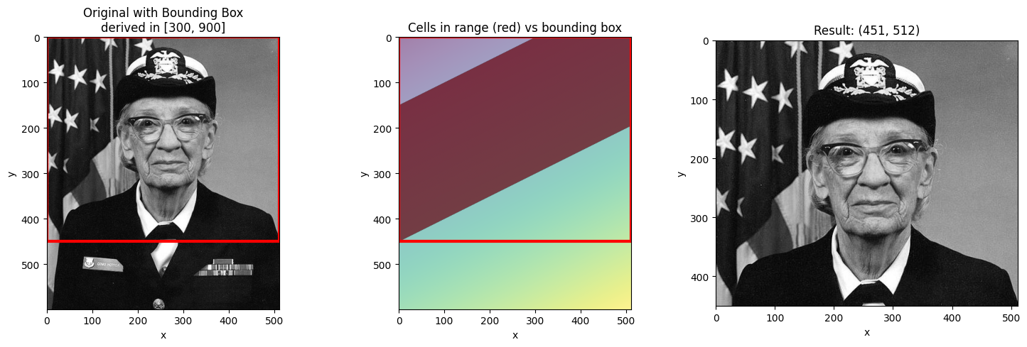
# Range at the edge
visualize_slice_selection(da_indexed, 0, 200);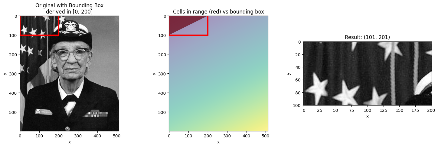
Filtering with .where() after Selection
Since the bounding box includes cells outside your requested range, you may want to
filter the result using .where() to mask out values not in the range.
start, stop = 400, 600
result = da_indexed.sel(derived=slice(start, stop))

# Filter to only show cells actually in range
in_range = (result.derived >= start) & (result.derived <= stop)
filtered = result.where(in_range)

fig, axes = plt.subplots(1, 3, figsize=(15, 5))

ax = axes[0]
ax.imshow(da_indexed.values, cmap="gray")
ax.set_title("Original")

ax = axes[1]
ax.imshow(result.values, cmap="gray")
ax.set_title("Bounding Box Result\n(includes cells outside range)")

ax = axes[2]
ax.imshow(filtered.values, cmap="gray")
ax.set_title("Filtered with .where()\n(only cells in range)")

plt.tight_layout()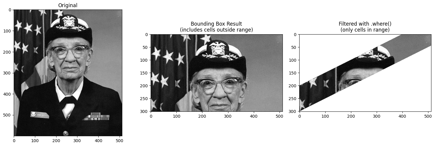
Using Step in Slices
You can include a step in the slice to subsample the innermost dimension.
start, stop = 400, 800

# Without step
result_no_step = da_indexed.sel(derived=slice(start, stop))

# With step=10 (subsample every 10th pixel in x)
result_with_step = da_indexed.sel(derived=slice(start, stop, 10))

print(f"Without step: {result_no_step.shape}")
print(f"With step=10: {result_with_step.shape}")
Without step: (401, 512)
With step=10: (401, 52)
fig, axes = plt.subplots(1, 2, figsize=(12, 6))

ax = axes[0]
ax.imshow(result_no_step.values, cmap="gray", aspect="auto")
ax.set_title(f"slice({start}, {stop})\nShape: {result_no_step.shape}")
ax.set_xlabel("x")
ax.set_ylabel("y")

ax = axes[1]
ax.imshow(result_with_step.values, cmap="gray", aspect="auto")
ax.set_title(f"slice({start}, {stop}, 10)\nShape: {result_with_step.shape}")
ax.set_xlabel("x (subsampled)")
ax.set_ylabel("y")

plt.tight_layout()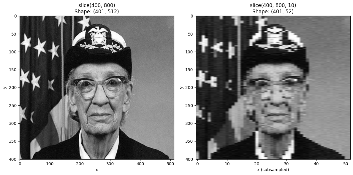
Non-Linear 2D Coordinates
The bounding box behavior becomes more interesting with non-linear coordinates. Let’s create a radial coordinate to see how this works.
# Create a radial coordinate centered on the image
cy, cx = ny // 2, nx // 2  # center
yy, xx = np.meshgrid(np.arange(ny) - cy, np.arange(nx) - cx, indexing="ij")
radial_coord = np.sqrt(xx**2 + yy**2)

# Create DataArray with radial coordinate
da_radial = xr.DataArray(
    gray,
    dims=["y", "x"],
    coords={
        "y": y_coord,
        "x": x_coord,
        "radius": (["y", "x"], radial_coord),
    },
    name="image",
)
da_radial_indexed = da_radial.set_xindex(["radius"], NDIndex)
fig, axes = plt.subplots(1, 2, figsize=(12, 6))
ax = axes[0]
ax.imshow(gray, cmap="gray")
ax.set_title("Original Image")
ax = axes[1]
im = ax.imshow(radial_coord, cmap="viridis")
ax.set_title("Radial Coordinate (distance from center)")
plt.colorbar(im, ax=ax, label="radius")
plt.tight_layout()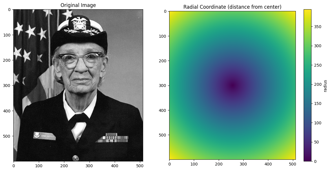
def visualize_radial_selection(da_indexed, start, stop):
    """Visualize selection on radial coordinate."""
    result = da_indexed.sel(radius=slice(start, stop))

    y_min, y_max = result.y.values[0], result.y.values[-1]
    x_min, x_max = result.x.values[0], result.x.values[-1]

    fig, axes = plt.subplots(1, 3, figsize=(15, 5))

    ax = axes[0]
    ax.imshow(da_indexed.values, cmap="gray")
    rect = plt.Rectangle(
        (x_min - 0.5, y_min - 0.5),
        x_max - x_min + 1,
        y_max - y_min + 1,
        fill=False,
        edgecolor="red",
        linewidth=3,
    )
    ax.add_patch(rect)
    ax.set_title(f"Bounding box for radius in [{start}, {stop}]")

    ax = axes[1]
    radius = da_indexed.radius.values
    in_range = (radius >= start) & (radius <= stop)
    ax.imshow(np.where(in_range, gray, gray * 0.3), cmap="gray")
    ax.set_title(f"Cells with radius in [{start}, {stop}]")

    ax = axes[2]
    ax.imshow(result.values, cmap="gray")
    ax.set_title(f"Result (bounding box): {result.shape}")

    plt.tight_layout()
    return fig
# Select an annulus (ring) - see how bounding box captures the whole ring
visualize_radial_selection(da_radial_indexed, 100, 150);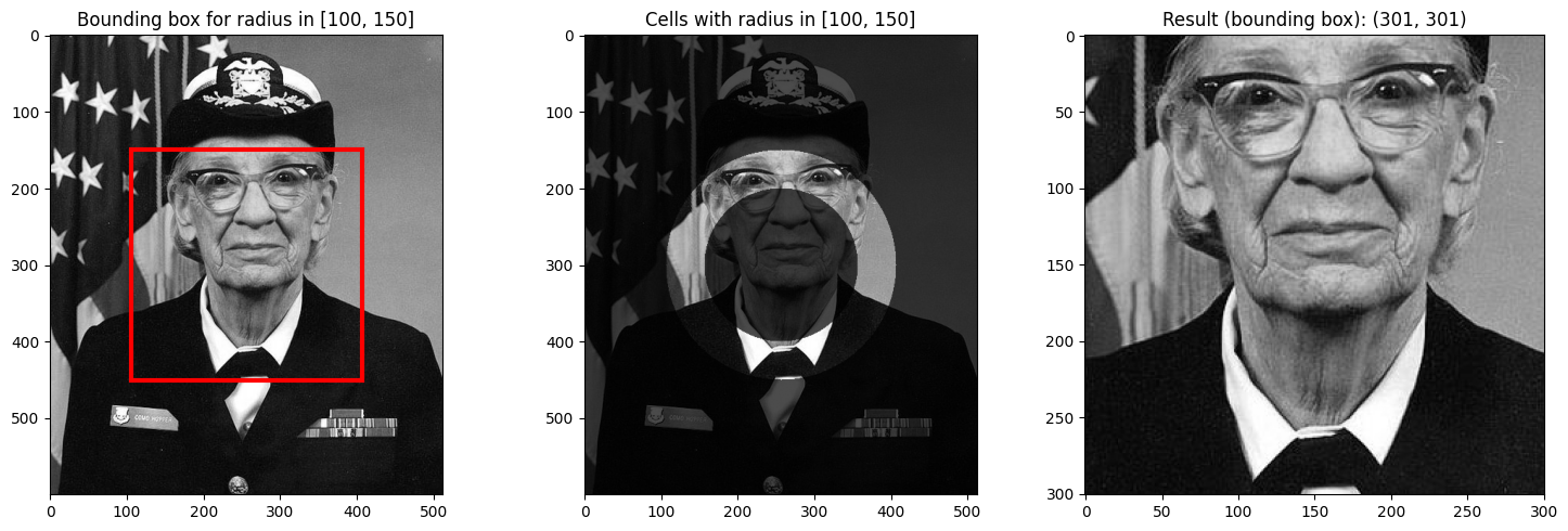
# Select center region
visualize_radial_selection(da_radial_indexed, 0, 100);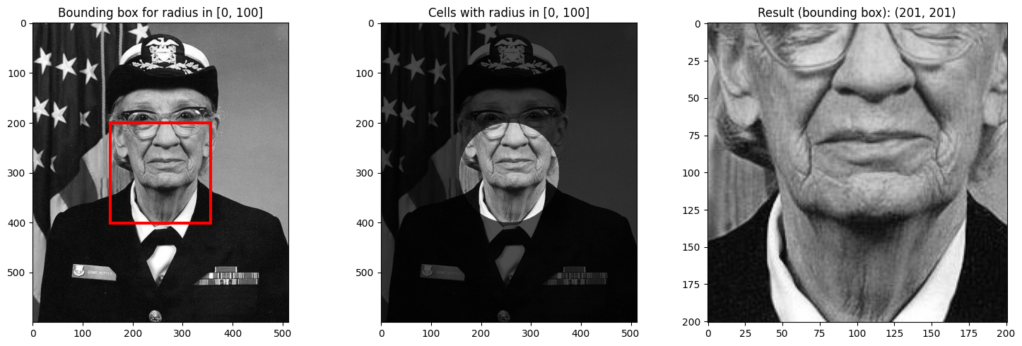
Notice how the bounding box for an annulus (ring) includes the entire rectangular region around the ring, even though only the ring itself has radius values in the requested range.
This is the key insight about NDIndex’s bounding box behavior: it returns the smallest rectangular region that contains all matching cells, which may include non-matching cells.
Summary
Key points about NDIndex slicing:
Scalar selection finds the single cell closest to the target value
Slice selection returns a bounding box containing all cells in range
The bounding box may include cells outside your requested range
Use
.where()after selection to mask out values not in rangeUse
slice(start, stop, step)to subsample the innermost dimension